Do you feel confused when you have too many screen sizes? Every time you think of writing HTML code for a website with a customizable interface, you feel chills?
We used to have to deal with this problem but now we don’t have to worry anymore. The trick here is that we first buy some ready-made templates from designers on platforms that sell templates like TemlateMonster.
We’ve discovered that you actually only need to customize on 3 screen sizes to satisfy most web users. It wasn’t long before we found a pretty quality article from Microsoft’s website. We quote verbatim for your reference.
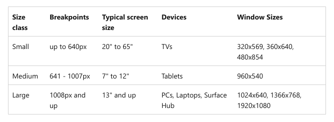
We recommended designing for a few key width categories (also called “breakpoints”):
Small (smaller than 640px)
Medium (641px to 1007px)
Large (1008px and larger)
The following summary table will make it easier for you to visualize:

With the above parameters, when creating CSS you will have the following lines:
@media screen and (max-width: 640px) {
body {
background-color: grey;
}
}@media screen and (min-width: 6480px) and (max-width: 1007px) {
body {
background-color: magenta;
}
}@media screen and (min-width: 1008px) {
body {
background-color: cyan;
}
}
That’s it!